BY Kathy Crosett
Are your clients doing everything they can to attract digital shoppers to their sites? If not, it may be time to sell clients your clients a website upgrade. Since the start of the pandemic, consumers are buying more of what they want online. When they encounter a website that doesn’t work, they’ll move on. If your clients’ websites aren’t delivering a great experience, you can sell more digital marketing services to help them improve their outcomes.
A new survey by Top Design Firms uncovers what appeals to typical U.S. shoppers. The survey includes the preferences of over 500 adults and reveals the following three website features are key:
- Photos
- Colors
- Functionality
Many small businesses that have long relied on foot traffic were finding it harder to compete with the likes of Amazon even before the pandemic started. Busy consumers weren’t always able to visit their local retailers during typical business hours. And when online giants started using their size to compete with offers like free shipping, local SMBs faced yet another challenge.
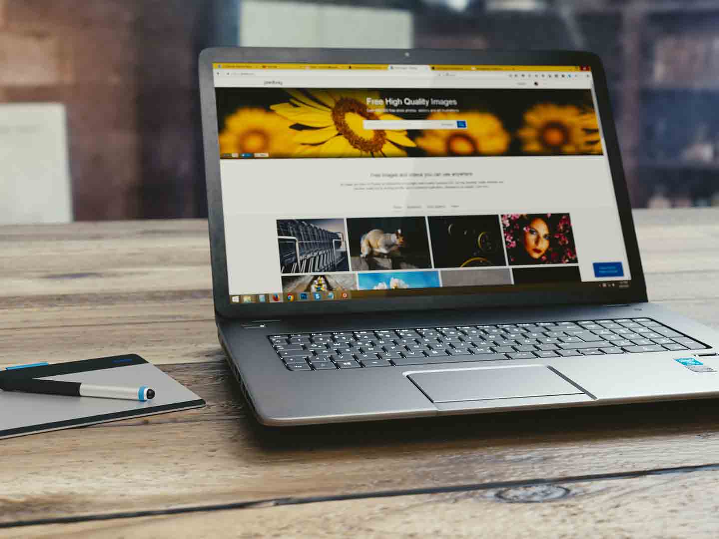
The first step in helping your clients level the playing field is to upgrade their websites. If your clients haven’t changed their sites in the past few years, consumers won’t bother to visit them. That’s because, these days, shoppers expect to see specific elements on a website. These elements include:
- Photos/images 40%
- Colors 39%
- Videos 21%
- Typography 19%
- Infographics/charts 15%
- Animation 12%
Photos
The shopping experience is highly visual. Consumers want to picture themselves happily using a new product. When your client displays images, whether it’s a happy kid wearing shoes or a family driving their new vehicle, the future customer can imagine themselves having the same experience. Encourage your client to add photos taken around town to play up their local appeal.
Color
More than one business has famously used color to build brand: think UPS and brown. Your client can use the same strategy. If they don’t have a logo or great tagline, help them develop one. Using these visuals in ad campaigns and on websites reinforces messaging. In addition, you can add color to the website navigation to improve the visitor experience. Placing a BUY button in the right color and in the best spot on a website will draw the visitor’s eye. Keep in mind that blue (46%) and green (30%) are especially appealing colors.
Functionality
When your client’s website doesn’t perform as expected, they could lose up to 42% of visitors. Consumers who are shopping online don’t want to encounter the “404 page not found” message. They’ll worry something is wrong with the business and move on to another site. If the navigation doesn’t make sense, consumers will give up as well. There’s no substitute for testing a site thoroughly before making it accessible to consumers. Your clients won’t have time to do that. But you can offer that option as part of your digital marketing services package.
Sell Your Clients a Website Upgrade
You can pitch your clients on a website upgrade by showing them information they may not have. Run a Digital Audit, on AdMall from SalesFuel to report on where their site traffic originates. With that tool, they’ll all see the average page views per visit and time spent on site. That data may convince them that it’s time to do a website upgrade.